Skill Partners Night
Skill Partners Night
Exclusive partner appreciation event for 100+ Armenian companies. Complete event
branding and spatial design for an intimate, high-impact corporate experience.
Exclusive partner appreciation event for 100+ Armenian companies. Complete event branding and spatial design for an intimate, high-impact corporate experience.
Exclusive partner appreciation event for 100+ Armenian companies. Complete event branding and spatial design for an intimate, high-impact corporate experience.
CLIENT
CLIENT
CLIENT
Skill Event Marketing Company
Skill Event Marketing Company
Skill Event Marketing Company
ROLE
ROLE
ROLE
Lead Designer
Lead Designer
Lead Designer
YEAR
YEAR
YEAR
2026
2026
2026
LIVE PROJECT
LIVE PROJECT
LIVE PROJECT
BACK
BACK
Event Design
Event Design
3D Design
3D Design
Print Design
Print Design
Motion Design
Motion Design
GUESTS
GUESTS
100+
100+
COMPANIES
COMPANIES
20+
20+
SPEAKERS
SPEAKERS
15+
15+
Event Branding
Event Branding
Printing Design
Printing Design
Lead
Designer.
Lead
Designer.
As Lead Designer, I defined the project’s visual direction and created its main approved key visual. I focused primarily on the digital side of the event, developing the core visual concept, motion assets, and animated content, including a two-minute video sequence built around fast-paced text animation and a more cinematic style. While junior designers handled most of the print production, I led the parts that shaped the project’s atmosphere and overall visual impact.
As Lead Designer, I defined the project’s visual direction and created its main approved key visual. I focused primarily on the digital side of the event, developing the core visual concept, motion assets, and animated content, including a two-minute video sequence built around fast-paced text animation and a more cinematic style. While junior designers handled most of the print production, I led the parts that shaped the project’s atmosphere and overall visual impact.
As Lead Designer, I defined the project’s visual direction and created its main approved key visual. I focused primarily on the digital side of the event, developing the core visual concept, motion assets, and animated content, including a two-minute video sequence built around fast-paced text animation and a more cinematic style. While junior designers handled most of the print production, I led the parts that shaped the project’s atmosphere and overall visual impact.
my role
my role
categories
categories
categories
Motion Design
Motion Design
Skill Partners Night had to celebrate both the company’s partner network and Skill’s 10th anniversary through an identity that felt memorable, premium, and event-defining. The challenge was to build something far more atmospheric than a standard corporate party visual, while making the message clear and strong enough to carry the event across digital content, motion, and production materials.
Skill Partners Night had to celebrate both the company’s partner network and Skill’s 10th anniversary through an identity that felt memorable, premium, and event-defining. The challenge was to build something far more atmospheric than a standard corporate party visual, while making the message clear and strong enough to carry the event across digital content, motion, and production materials.
Skill Partners Night had to celebrate both the company’s partner network and Skill’s 10th anniversary through an identity that felt memorable, premium, and event-defining. The challenge was to build something far more atmospheric than a standard corporate party visual, while making the message clear and strong enough to carry the event across digital content, motion, and production materials.
Challenge
Challenge
Approach.
Approach.
Approach.
I built the concept around a cinematic space theme, using falling stars as a symbol of partner companies and a hero-like composition to emphasize their importance within the event story. To push the visual further, I combined 2D and 3D elements inside the main design and extended the identity through motion, creating a more immersive system with stronger atmosphere and emotional impact.
I built the concept around a cinematic space theme, using falling stars as a symbol of partner companies and a hero-like composition to emphasize their importance within the event story. To push the visual further, I combined 2D and 3D elements inside the main design and extended the identity through motion, creating a more immersive system with stronger atmosphere and emotional impact.
I built the concept around a cinematic space theme, using falling stars as a symbol of partner companies and a hero-like composition to emphasize their importance within the event story. To push the visual further, I combined 2D and 3D elements inside the main design and extended the identity through motion, creating a more immersive system with stronger atmosphere and emotional impact.
challenge & approach
challenge & approach
Key Visual
& Identity System.
Key Visual
& Identity System.
Key Visual
& Identity System.
showcase
showcase
showcase
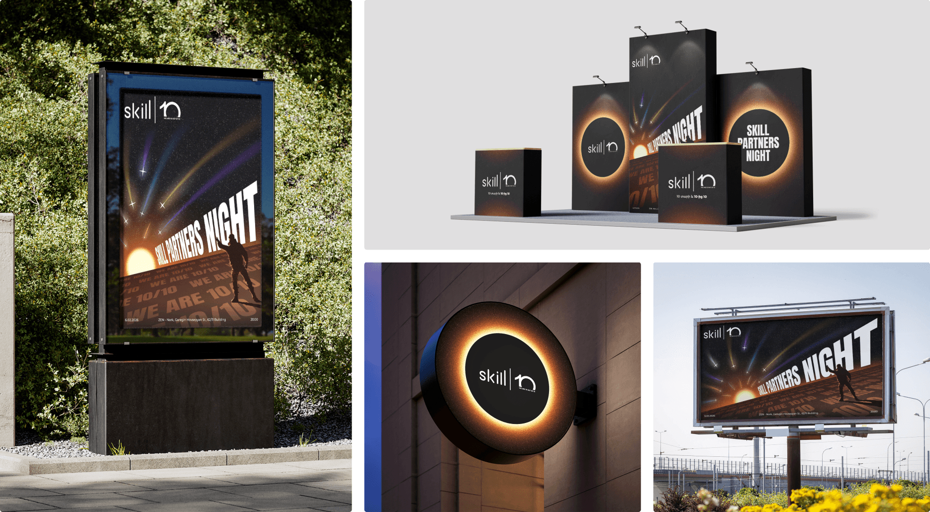
The key visual system was built to create immediate impact through scale, cinematic perspective, and a strong contrast between darkness and light. Large typography, cosmic depth, and the falling-star motif made the identity instantly recognizable across different formats, while the composition kept the anniversary message and event atmosphere clear, bold, and consistent.
The key visual system was built to create immediate impact through scale, cinematic perspective, and a strong contrast between darkness and light. Large typography, cosmic depth, and the falling-star motif made the identity instantly recognizable across different formats, while the composition kept the anniversary message and event atmosphere clear, bold, and consistent.
The key visual system was built to create immediate impact through scale, cinematic perspective, and a strong contrast between darkness and light. Large typography, cosmic depth, and the falling-star motif made the identity instantly recognizable across different formats, while the composition kept the anniversary message and event atmosphere clear, bold, and consistent.
Motion
Design.
Motion
Design.
The motion design was created as a two-minute opening piece for the main screen, built to turn the key visual into a more immersive start to the event. I animated the main design itself first and then layered typography over it, treating motion as a core part of the atmosphere rather than just a supporting asset. Since it was assigned as a last-minute task and completed on the morning of the event, it also became one of the project’s most technically demanding parts.
The motion design was created as a two-minute opening piece for the main screen, built to turn the key visual into a more immersive start to the event. I animated the main design itself first and then layered typography over it, treating motion as a core part of the atmosphere rather than just a supporting asset. Since it was assigned as a last-minute task and completed on the morning of the event, it also became one of the project’s most technically demanding parts.
The motion design was created as a two-minute opening piece for the main screen, built to turn the key visual into a more immersive start to the event. I animated the main design itself first and then layered typography over it, treating motion as a core part of the atmosphere rather than just a supporting asset. Since it was assigned as a last-minute task and completed on the morning of the event, it also became one of the project’s most technically demanding parts.
showcase
showcase
Real Life
Implementation.
Real Life
Implementation.
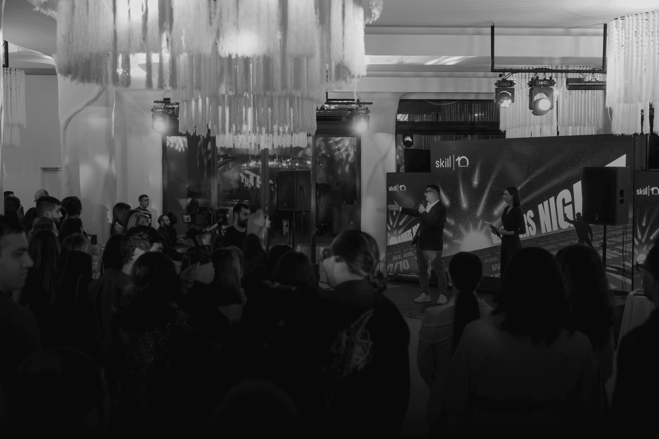
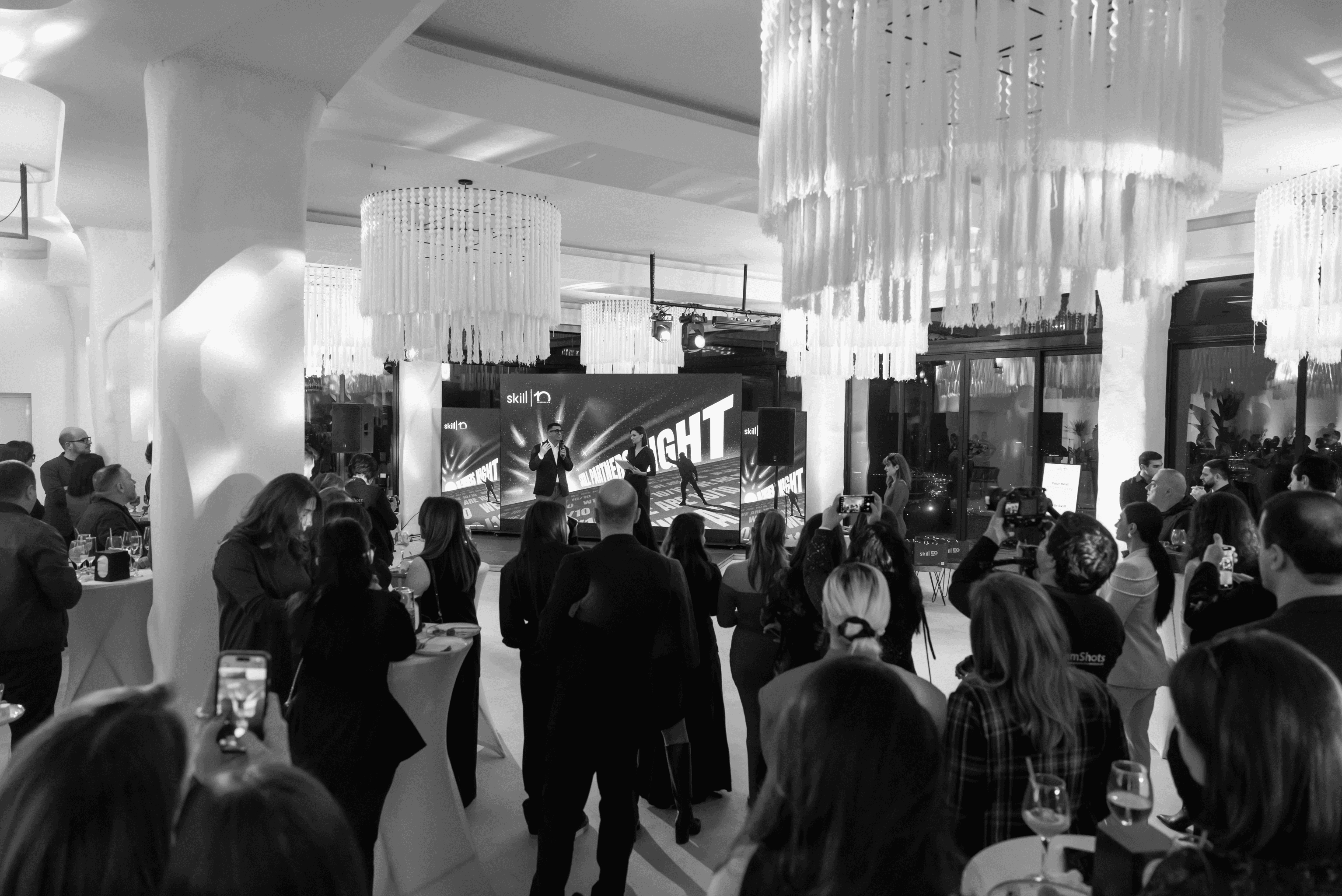
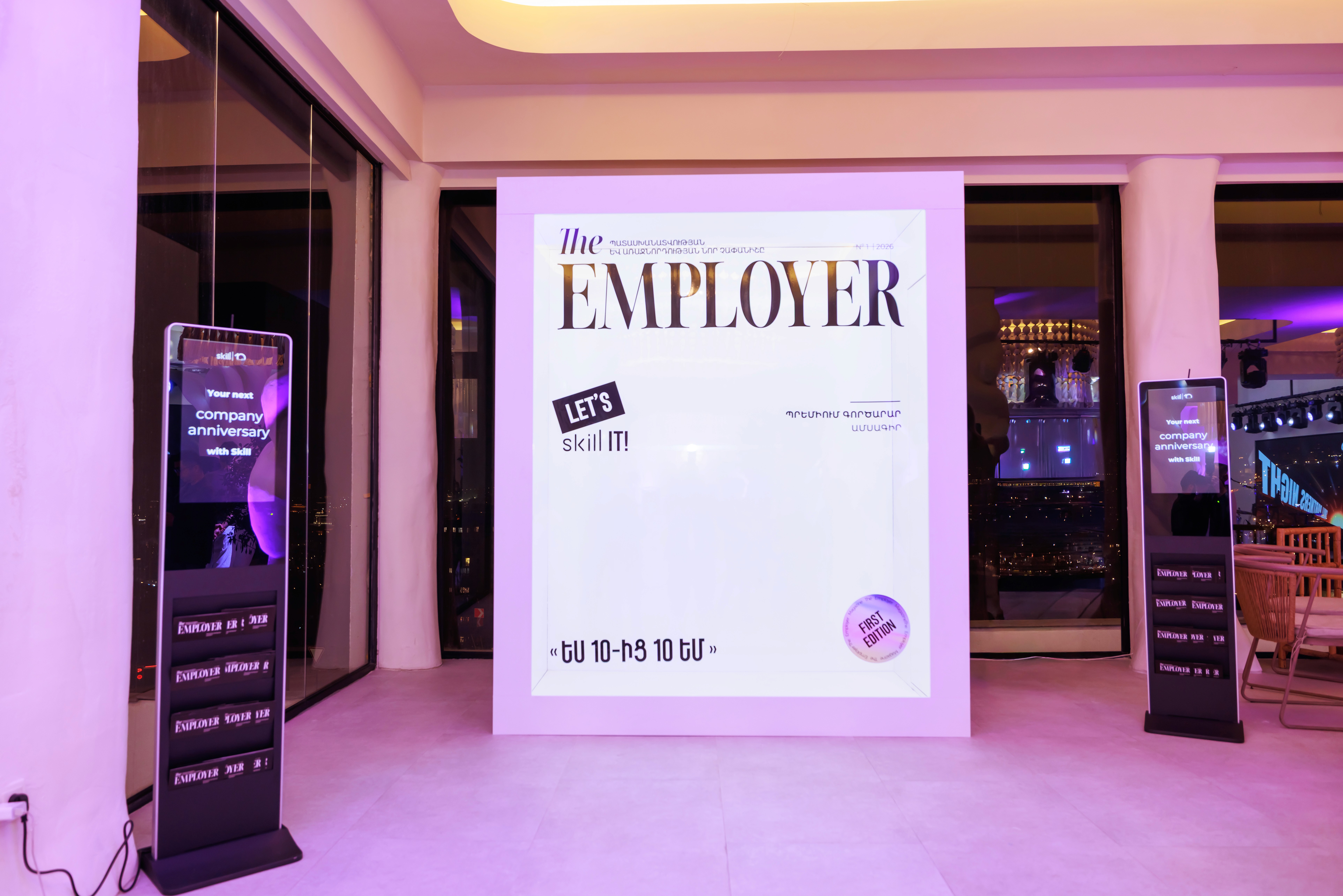
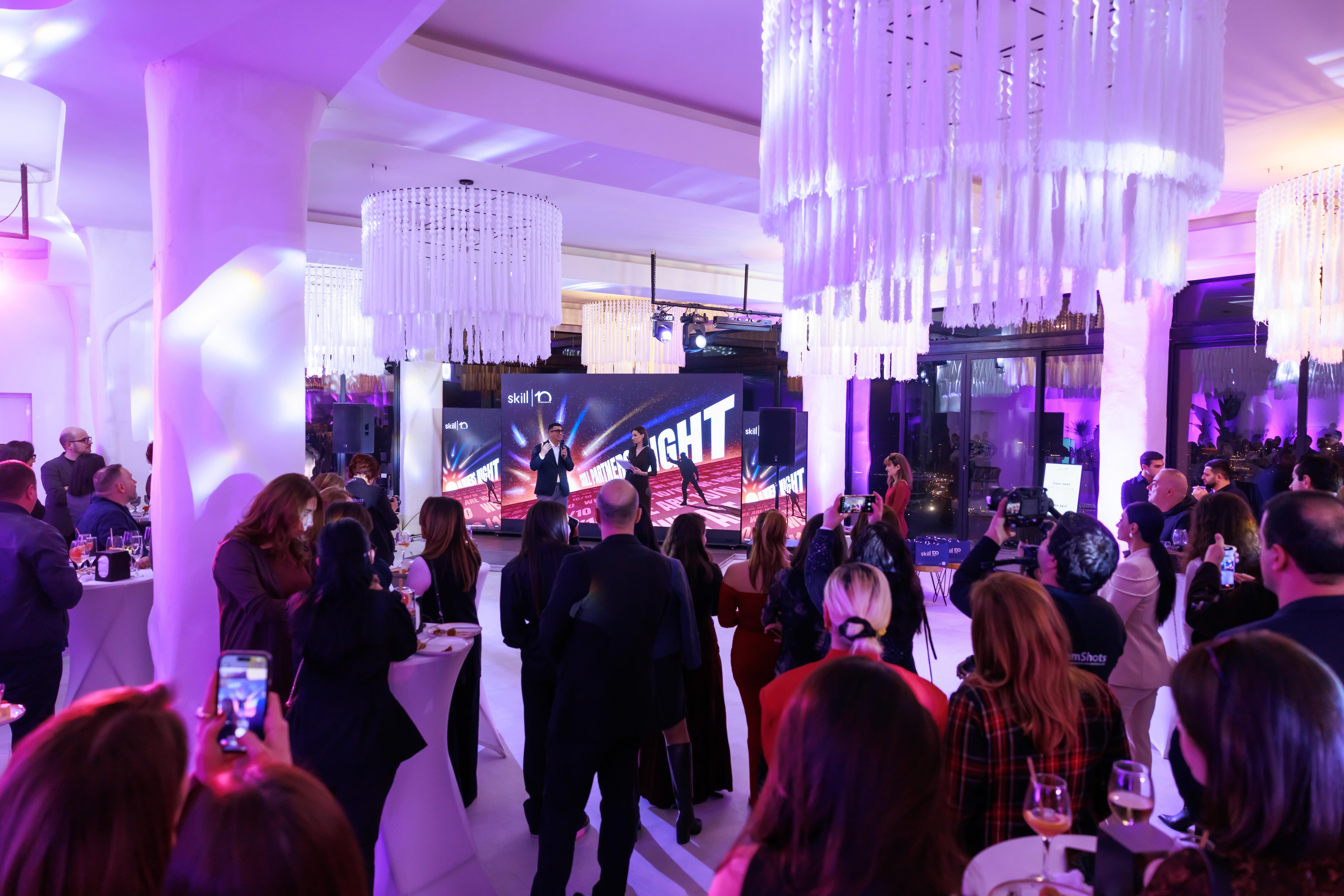
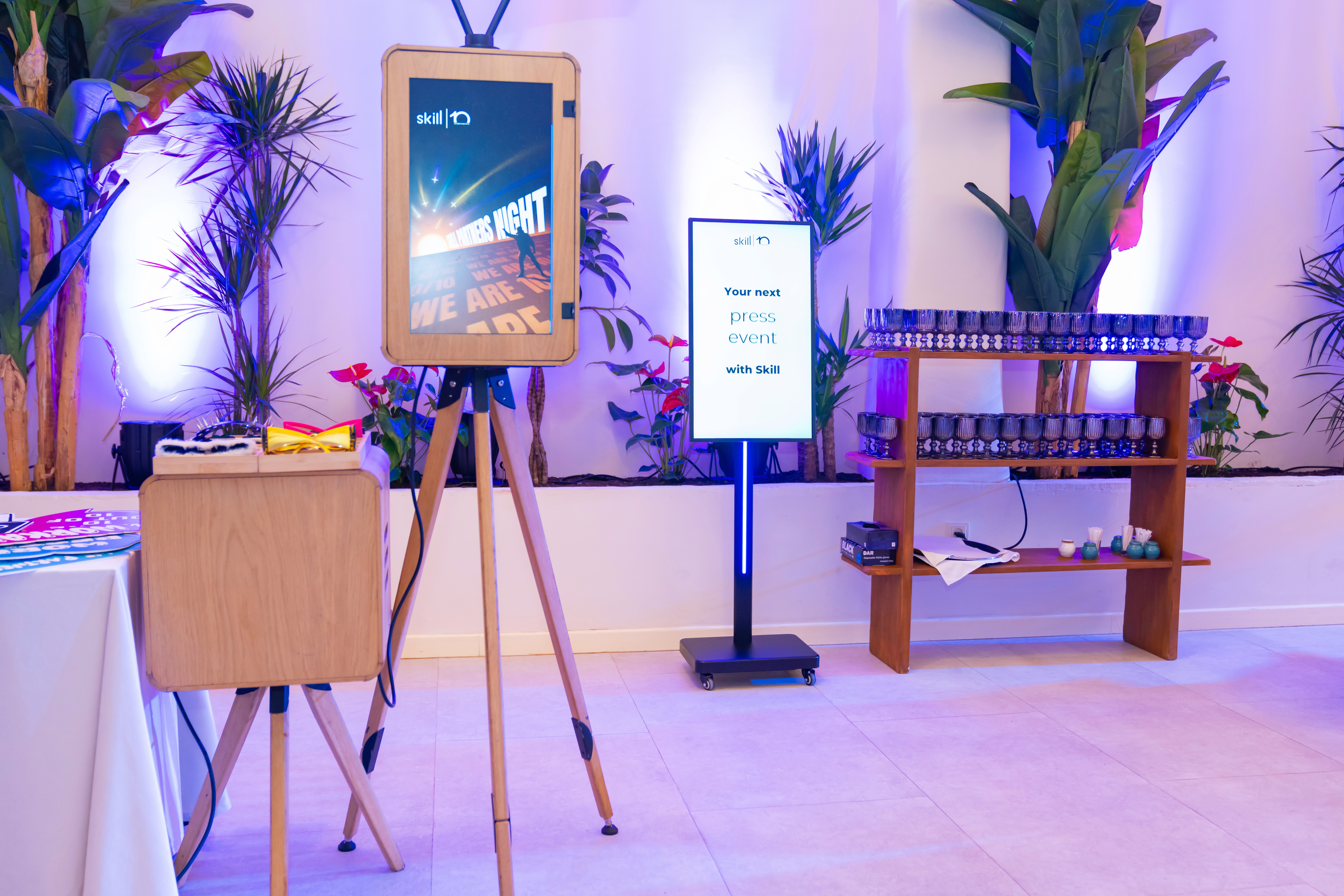
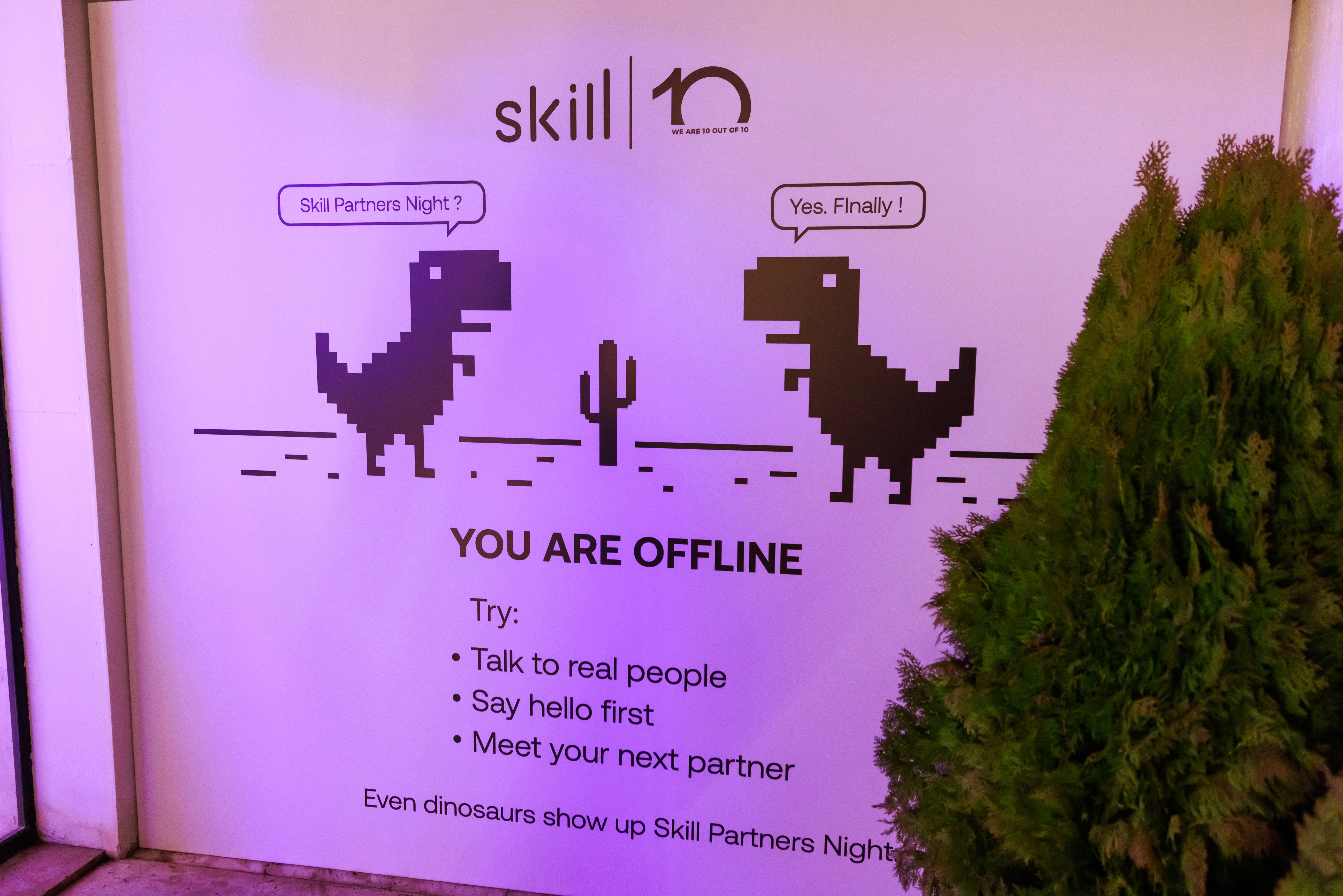
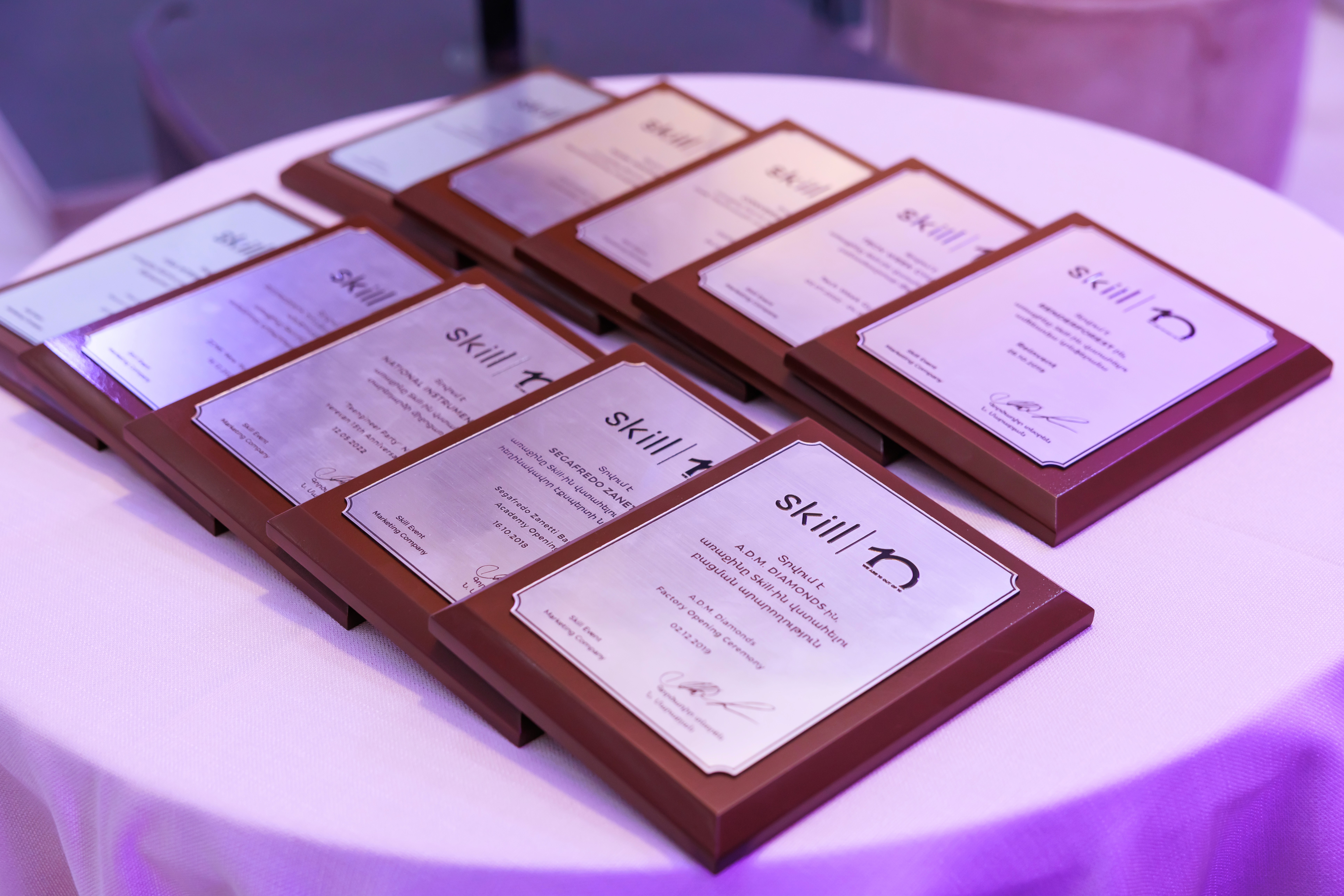
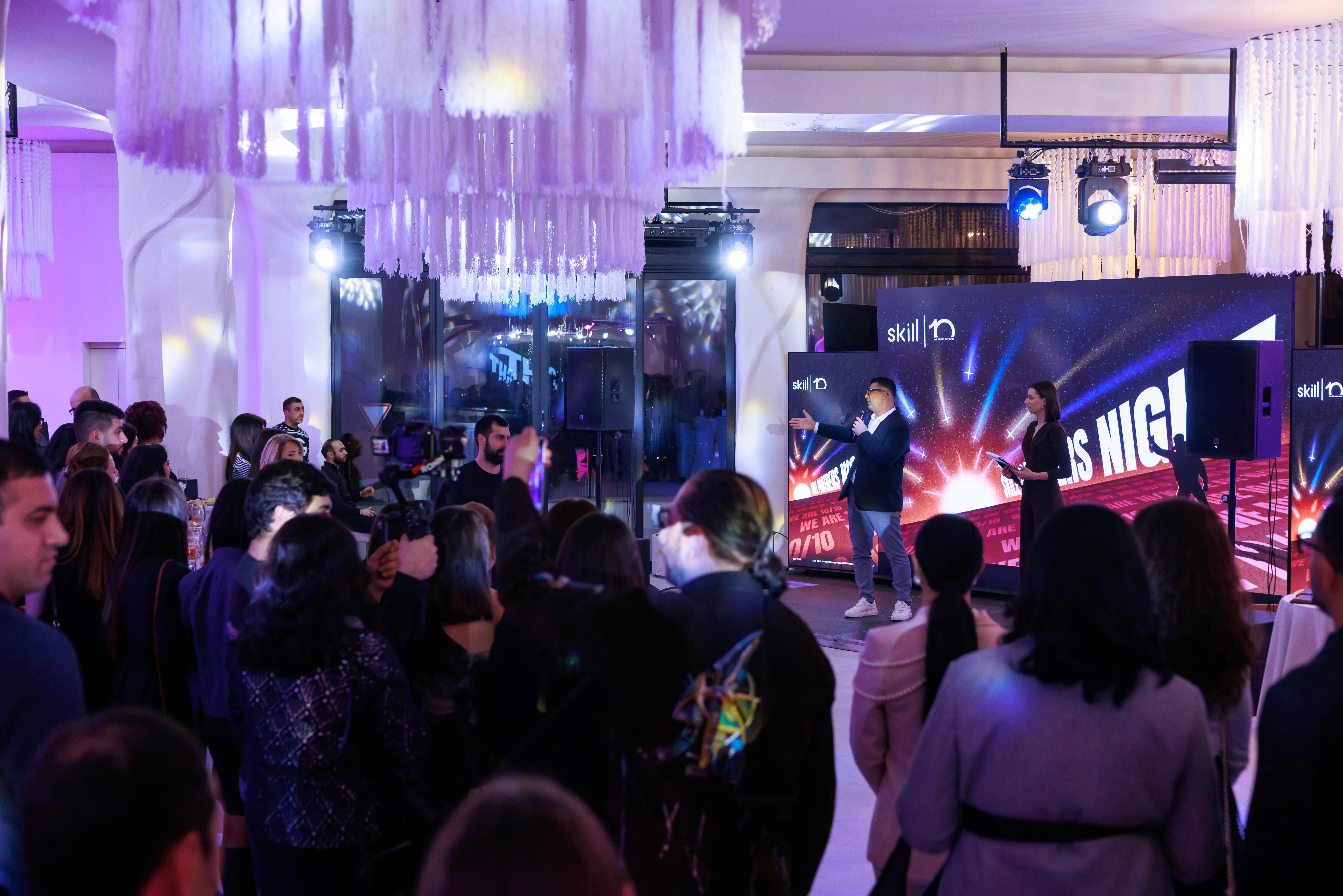
The identity was implemented across the live event environment, from the main screen and digital touchpoints to smaller branded details within the space. Seeing the concept hold up in real conditions — with lighting, crowd presence, and motion on screen — was an important part of the project, especially because so much of its impact depended on atmosphere.
The identity was implemented across the live event environment, from the main screen and digital touchpoints to smaller branded details within the space. Seeing the concept hold up in real conditions — with lighting, crowd presence, and motion on screen — was an important part of the project, especially because so much of its impact depended on atmosphere.
The identity was implemented across the live event environment, from the main screen and digital touchpoints to smaller branded details within the space. Seeing the concept hold up in real conditions — with lighting, crowd presence, and motion on screen — was an important part of the project, especially because so much of its impact depended on atmosphere.
showcase
BACK TO ALL PROJECTS