Reinvent by RenderForest 2025
Reinvent by RenderForest 2025
Reinvent by RenderForest 2025
Brand identity and event design for Armenia's premier digital conference. 2,000+
specialists exploring entrepreneurship, IT, marketing, and design innovation.
Brand identity and event design for Armenia's premier digital conference. 2,000+
specialists exploring entrepreneurship, IT, marketing, and design innovation.
Brand identity and event design for Armenia's premier digital conference. 2,000+ specialists exploring entrepreneurship, IT, marketing, and design innovation.
CLIENT
CLIENT
RenderForest
RenderForest
ROLE
ROLE
Lead Designer
Lead Designer
Lead Designer
YEAR
YEAR
2025
2025
LIVE PROJECT
LIVE PROJECT
LIVE PROJECT
BACK
BACK
Brand Identity
Event Design
3D Design
Motion Design
Brand Identity
Event Design
3D Design
Motion Design
VISITORS
VISITORS
1500+
1500+
COMPANIES
COMPANIES
4
4
SPEAKERS
SPEAKERS
30+
30+
Brand Identity
Brand Identity
Social Media Design
Social Media Design
Printing Design
Printing Design
Printing Design
Lead
Designer.
Lead
Designer.
As Lead Designer, I was responsible for the project’s main visual direction and the core identity used across digital and printed materials. I created the main design and adapted it into social media and print applications, making sure the system stayed visually consistent while presenting Reinvent 2025 as a bold and future-focused conference.
As Lead Designer, I was responsible for the project’s main visual direction and the core identity used across digital and printed materials. I created the main design and adapted it into social media and print applications, making sure the system stayed visually consistent while presenting Reinvent 2025 as a bold and future-focused conference.
As Lead Designer, I was responsible for the project’s main visual direction and the core identity used across digital and printed materials. I created the main design and adapted it into social media and print applications, making sure the system stayed visually consistent while presenting Reinvent 2025 as a bold and future-focused conference.
my role
my role
categories
categories
Reinvent 2025 needed an identity that felt new, future-facing, and strong enough for a conference centered on innovation, digital industries, and the fourth industrial revolution. The main challenge was to create a visual language that stood out from previous editions while still working clearly across promotional and printed formats.
Reinvent 2025 needed an identity that felt new, future-facing, and strong enough for a conference centered on innovation, digital industries, and the fourth industrial revolution. The main challenge was to create a visual language that stood out from previous editions while still working clearly across promotional and printed formats.
Reinvent 2025 needed an identity that felt new, future-facing, and strong enough for a conference centered on innovation, digital industries, and the fourth industrial revolution. The main challenge was to create a visual language that stood out from previous editions while still working clearly across promotional and printed formats.
Challenge
Challenge
Approach.
Approach.
Approach.
I built the concept around a retro-futuristic digital aesthetic, using pixel-based forms, transformation, and motion-like flow to reflect technological change and progress. Since achieving the pixelated look in a clean and controlled way was new for me, the project also became an exploration of a different visual direction while keeping the final system bold, readable, and adaptable.
I built the concept around a retro-futuristic digital aesthetic, using pixel-based forms, transformation, and motion-like flow to reflect technological change and progress. Since achieving the pixelated look in a clean and controlled way was new for me, the project also became an exploration of a different visual direction while keeping the final system bold, readable, and adaptable.
I built the concept around a retro-futuristic digital aesthetic, using pixel-based forms, transformation, and motion-like flow to reflect technological change and progress. Since achieving the pixelated look in a clean and controlled way was new for me, the project also became an exploration of a different visual direction while keeping the final system bold, readable, and adaptable.
challenge & approach
challenge & approach
Key Visual
& Identity System.
Key Visual
& Identity System.
Key Visual
& Identity System.
showcase
showcase
showcase
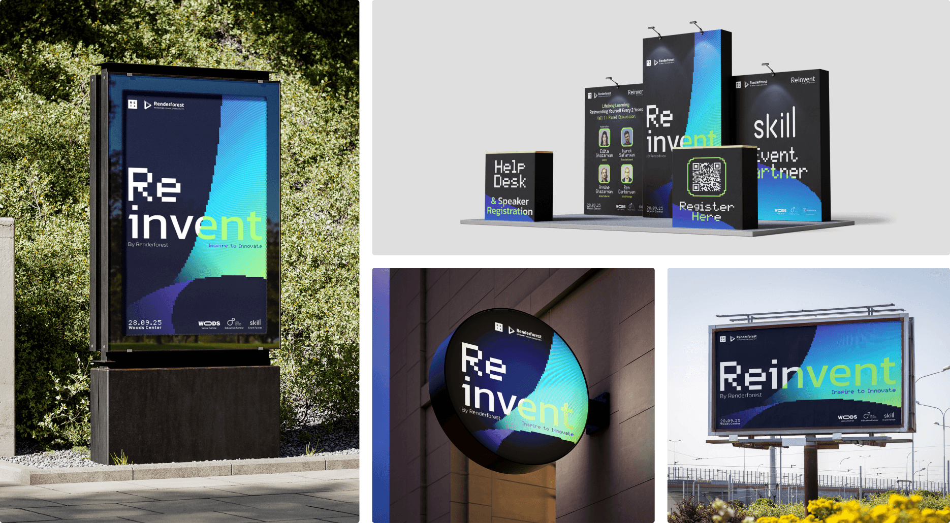
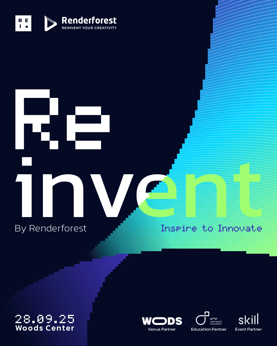
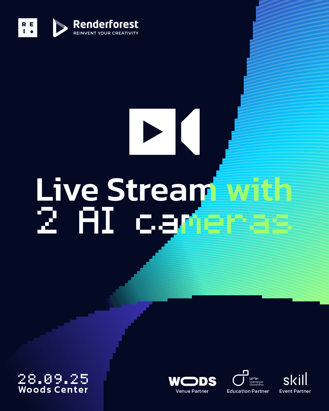
The key visual system was built around a retro-futuristic digital aesthetic, combining pixel-based typography with flowing gradients and transformation-like shapes. This gave the identity a distinct, innovation-focused look while keeping it bold, readable, and flexible across social media, print, and event applications.
The key visual system was built around a retro-futuristic digital aesthetic, combining pixel-based typography with flowing gradients and transformation-like shapes. This gave the identity a distinct, innovation-focused look while keeping it bold, readable, and flexible across social media, print, and event applications.
The key visual system was built around a retro-futuristic digital aesthetic, combining pixel-based typography with flowing gradients and transformation-like shapes. This gave the identity a distinct, innovation-focused look while keeping it bold, readable, and flexible across social media, print, and event applications.
main design
partner post
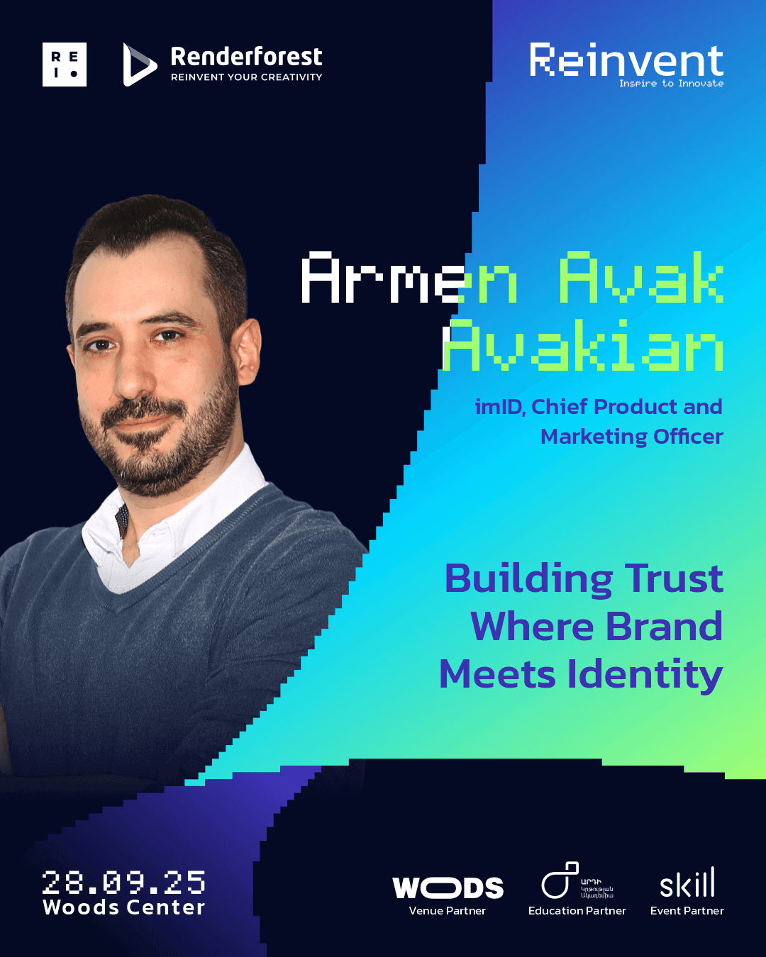
Speaker post
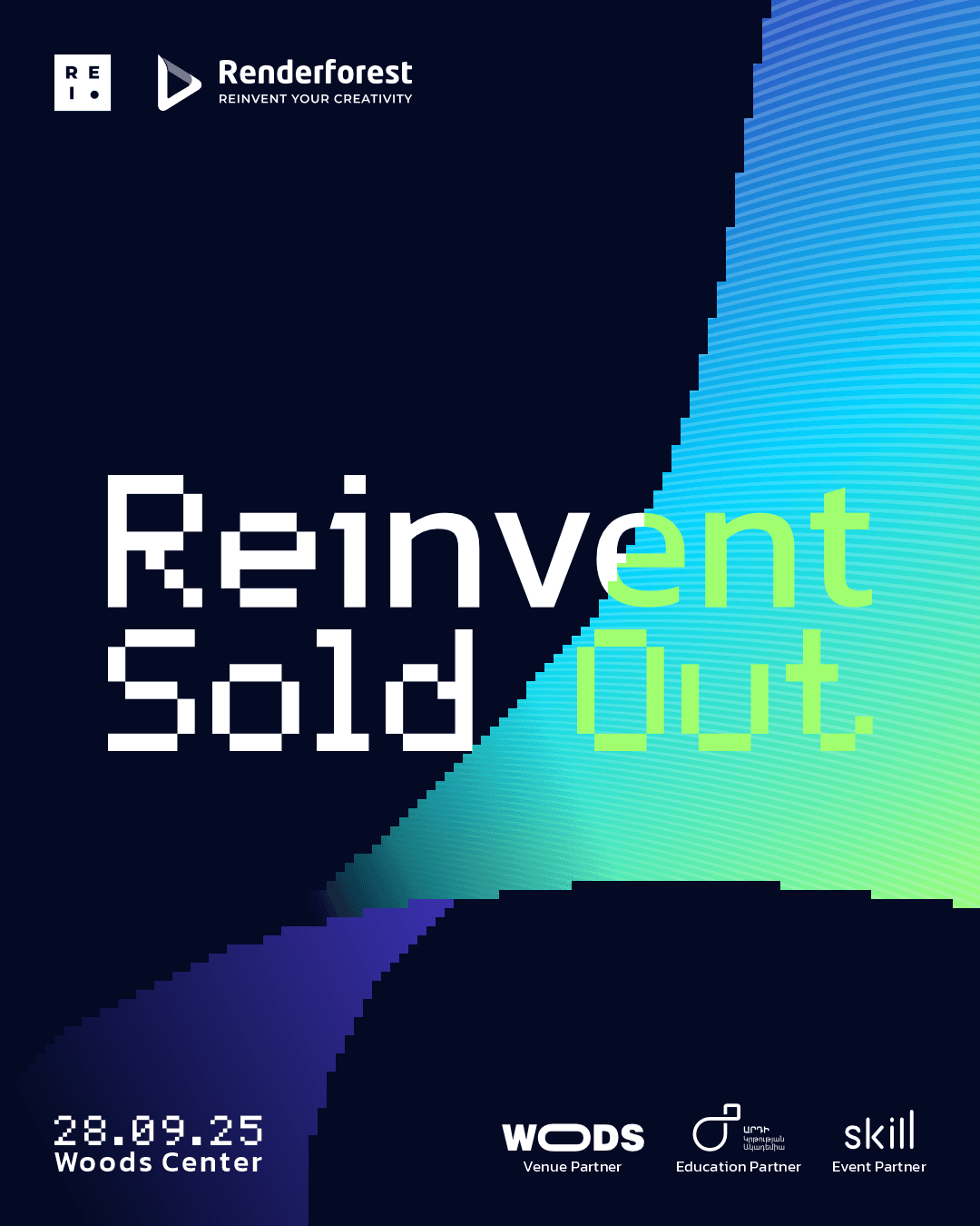
information post 01
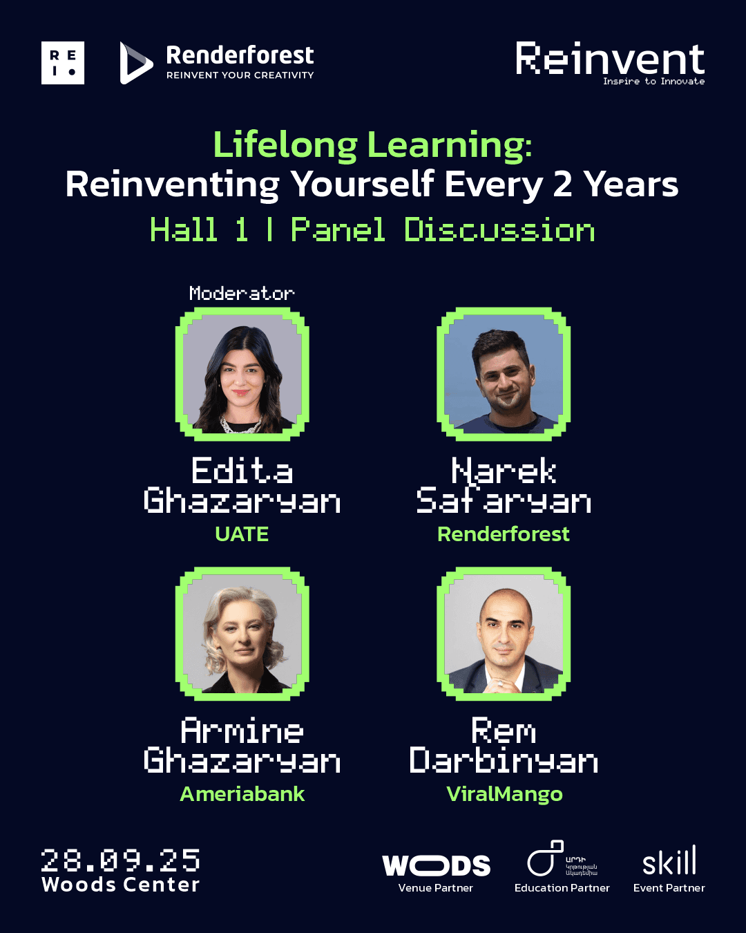
Panel discussion post
information post 02
Social Media
System.
Social Media
System.
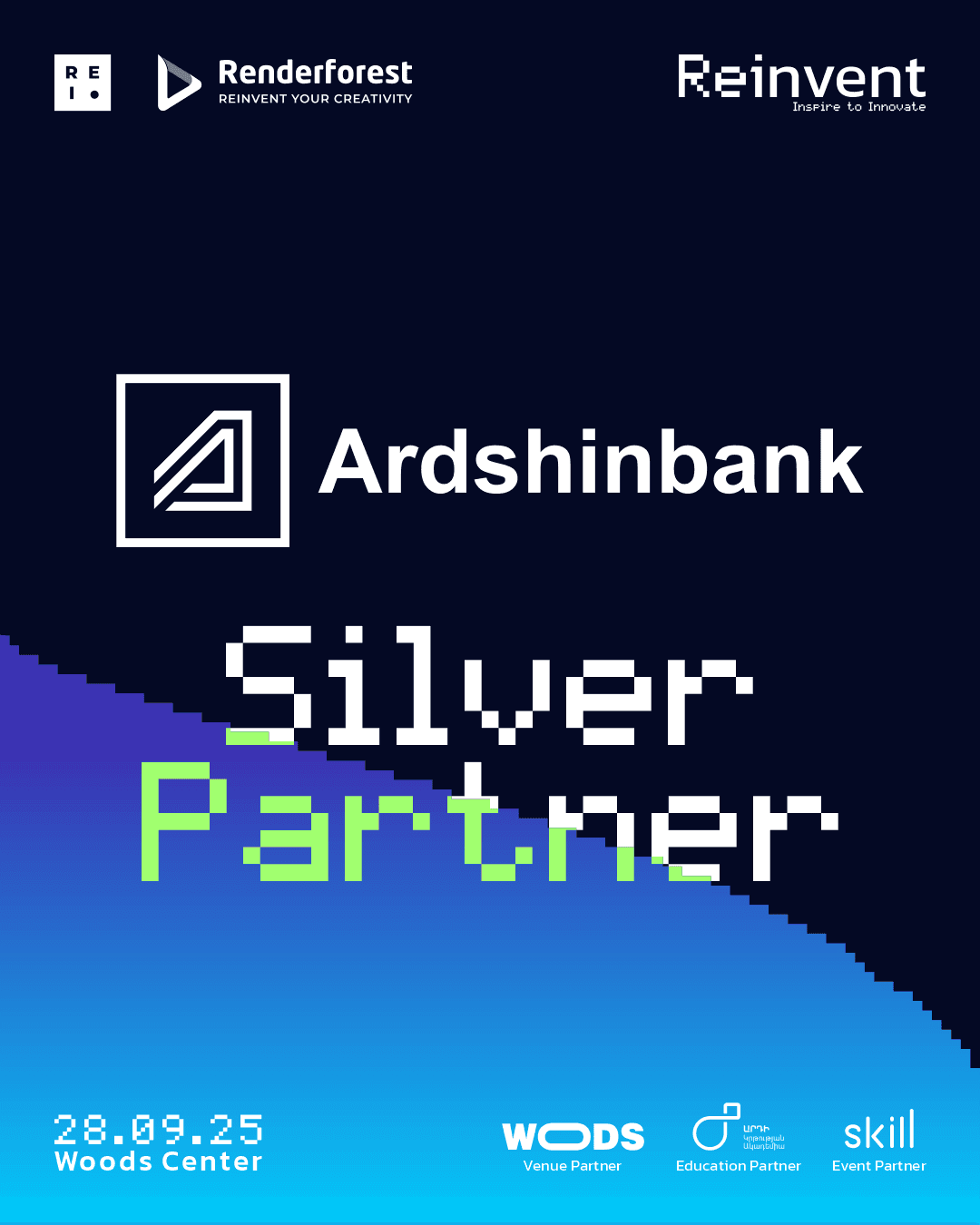
I extended the identity into a social media system built for different content types, including speaker announcements, partner posts, schedules, and informational updates. The challenge was to keep a visually distinctive look while making the templates flexible enough for repeated daily use, so the final system stayed consistent, recognizable, and easy to scale across the campaign.
I extended the identity into a social media system built for different content types, including speaker announcements, partner posts, schedules, and informational updates. The challenge was to keep a visually distinctive look while making the templates flexible enough for repeated daily use, so the final system stayed consistent, recognizable, and easy to scale across the campaign.
showcase
showcase
Real Life
Implementation.
Real Life
Implementation.
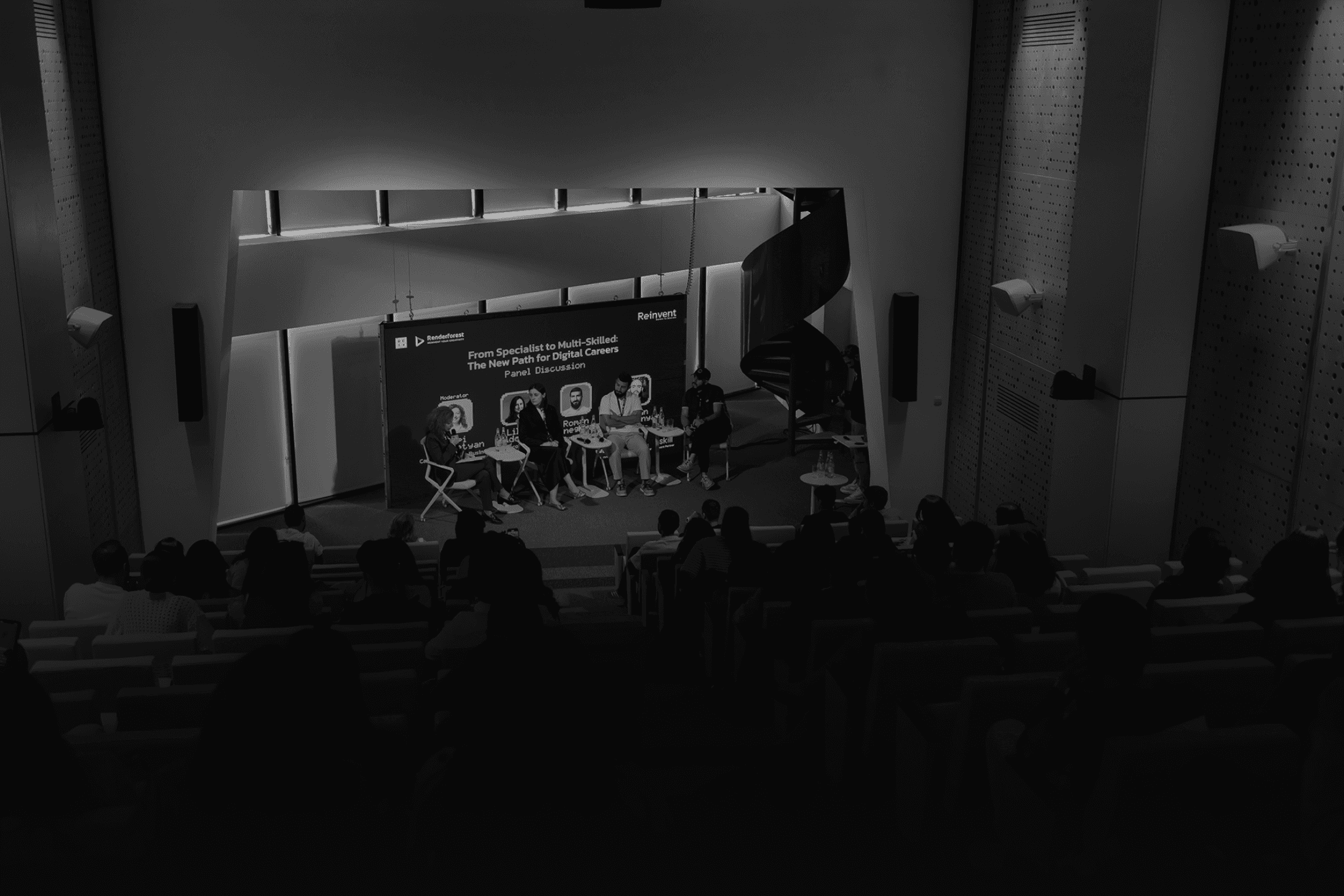
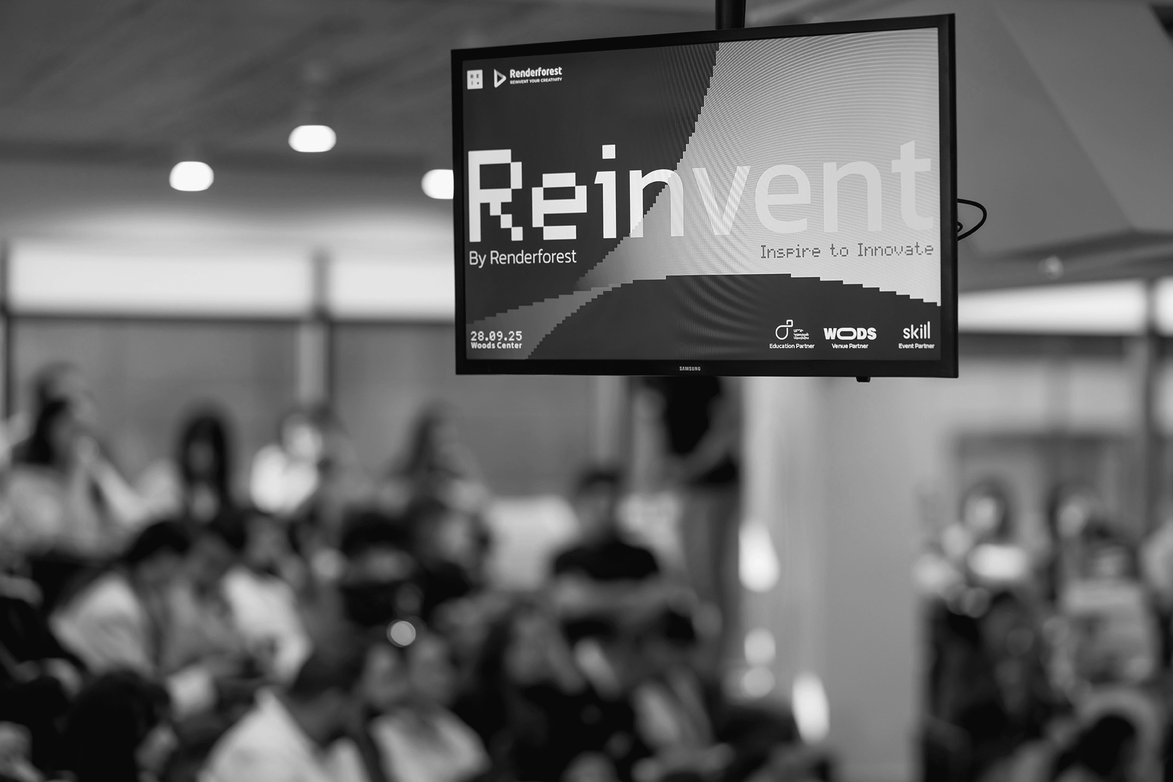
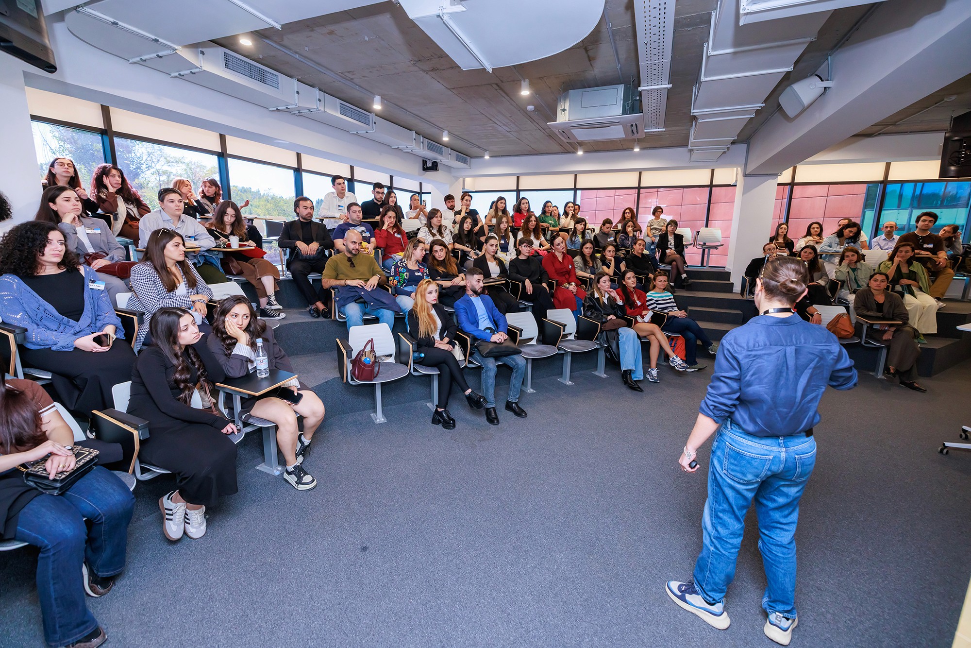
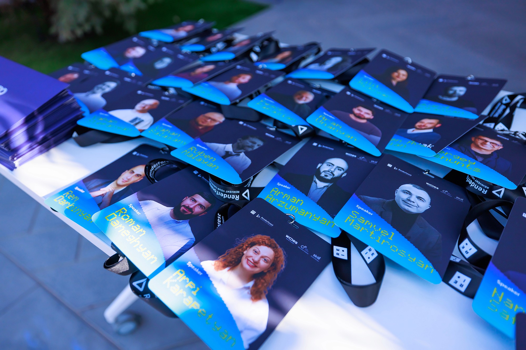
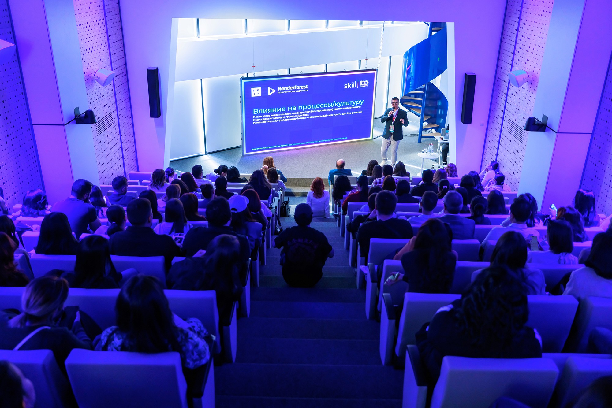
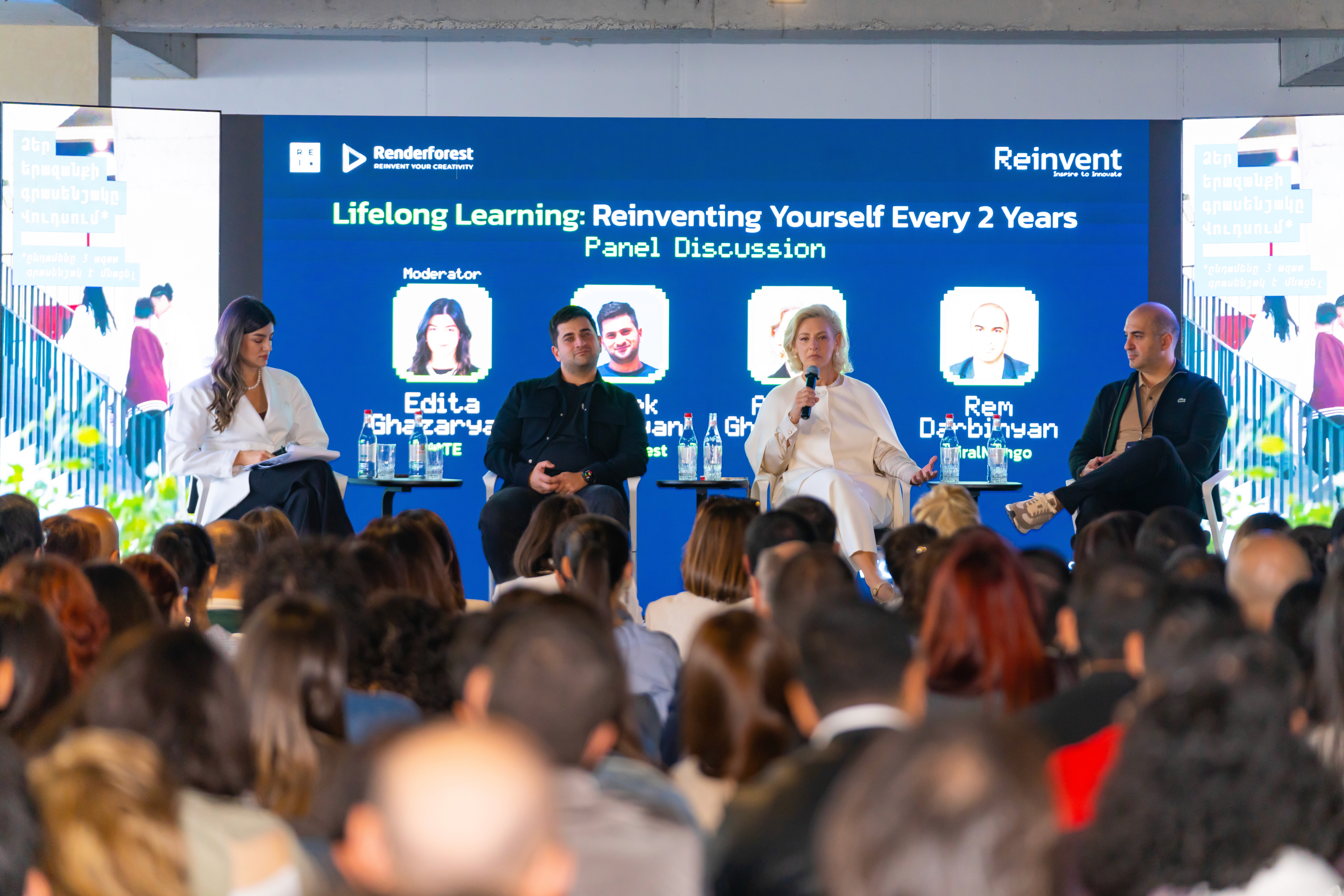
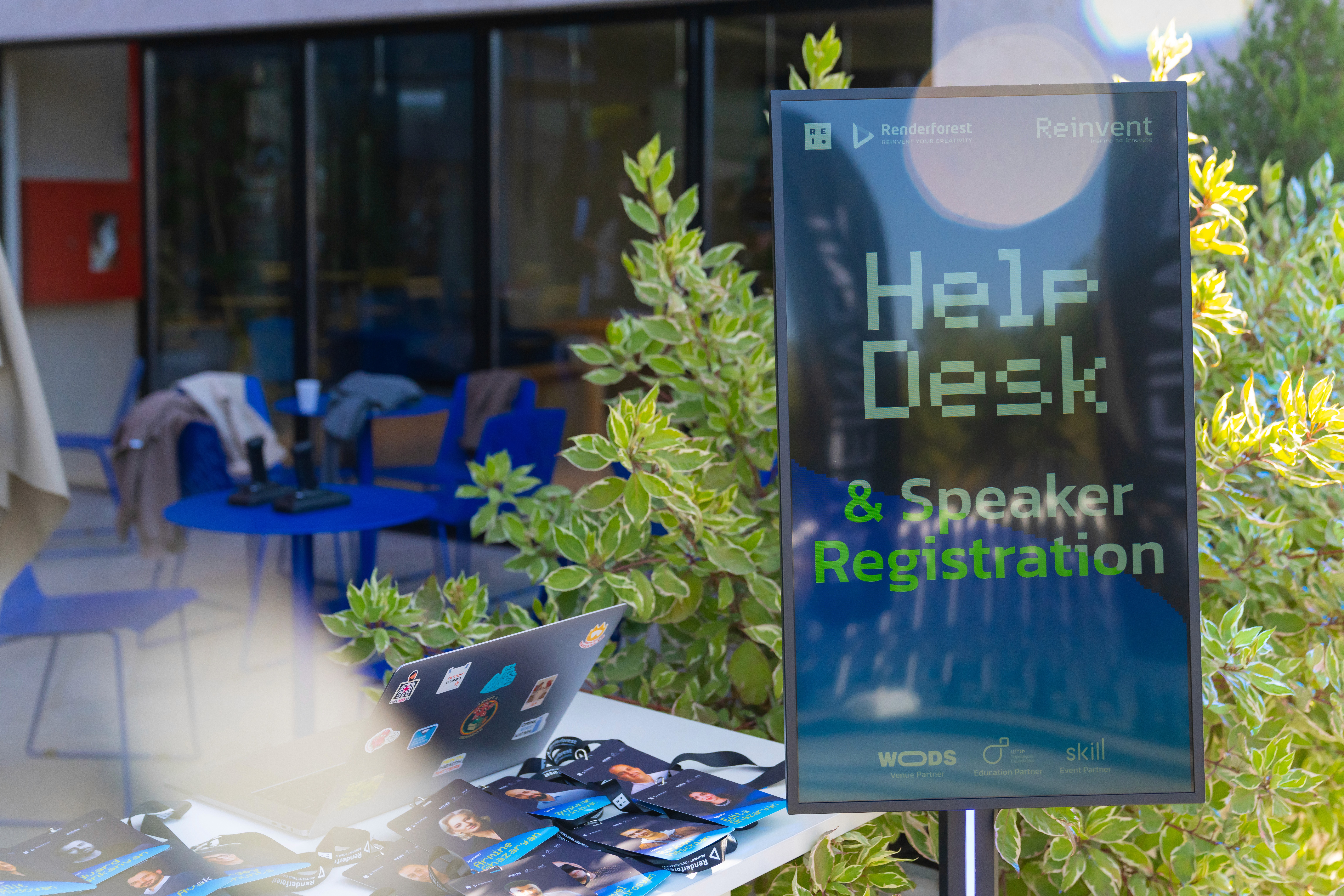
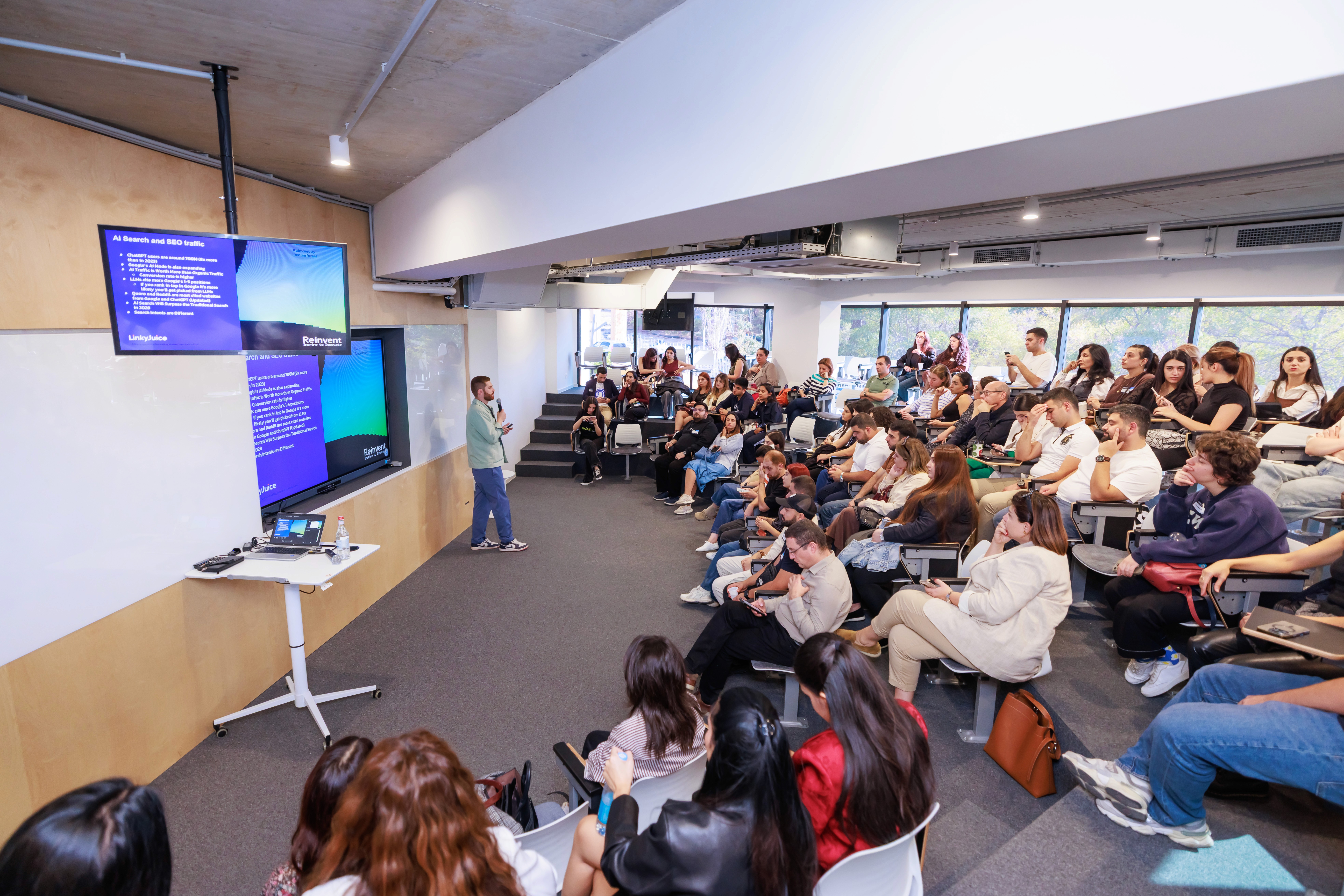
The final identity was implemented across the event’s public-facing materials, from social media and printed applications to on-site branded elements. A key measure of success was seeing the system stay clear and recognizable in real use, while preserving the same bold, innovation-focused atmosphere across different formats.
The final identity was implemented across the event’s public-facing materials, from social media and printed applications to on-site branded elements. A key measure of success was seeing the system stay clear and recognizable in real use, while preserving the same bold, innovation-focused atmosphere across different formats.
The final identity was implemented across the event’s public-facing materials, from social media and printed applications to on-site branded elements. A key measure of success was seeing the system stay clear and recognizable in real use, while preserving the same bold, innovation-focused atmosphere across different formats.
showcase
BACK TO ALL PROJECTS